A Bold New Look: The Story Behind nuwacom’s New Corporate Design
Published

At nuwacom, we are on a mission to transform the way marketing and communication teams work. As our platform evolves, so does our brand.
Our new corporate design is more than just a fresh look — it’s a reflection of who we are. With a refined logo, modern typography, and a bold color palette, we are reinforcing our commitment to efficiency, automation, collaboration, and growth.

Why We Rebranded – A Vision for the Future
A strong brand evolves alongside the product it represents. As nuwacom continues to develop, our new identity ensures that design and functionality move forward together, creating a more cohesive and intuitive experience.
This transformation is more than a visual refresh — it marks the beginning of an ongoing process to refine both our platform and the way we present it. While our solutions already drive efficiency, automation, and collaboration, we are continuously working to enhance usability, streamline workflows, and create an even more seamless experience.
With this evolution, we aim to:
- Strengthen our positioning as the go-to AI workspace for marketing and communication teams.
- Align our brand identity with our product experience to create a consistent, user-focused journey.
- Drive continuous improvements that make work easier, more efficient, and more impactful.
This rebrand sets the foundation for what’s next—an ever-improving platform experience designed to keep pace with the evolving needs of modern teams.

The Design Story – More Than Just a Logo
The Figurative Mark and Its Meaning
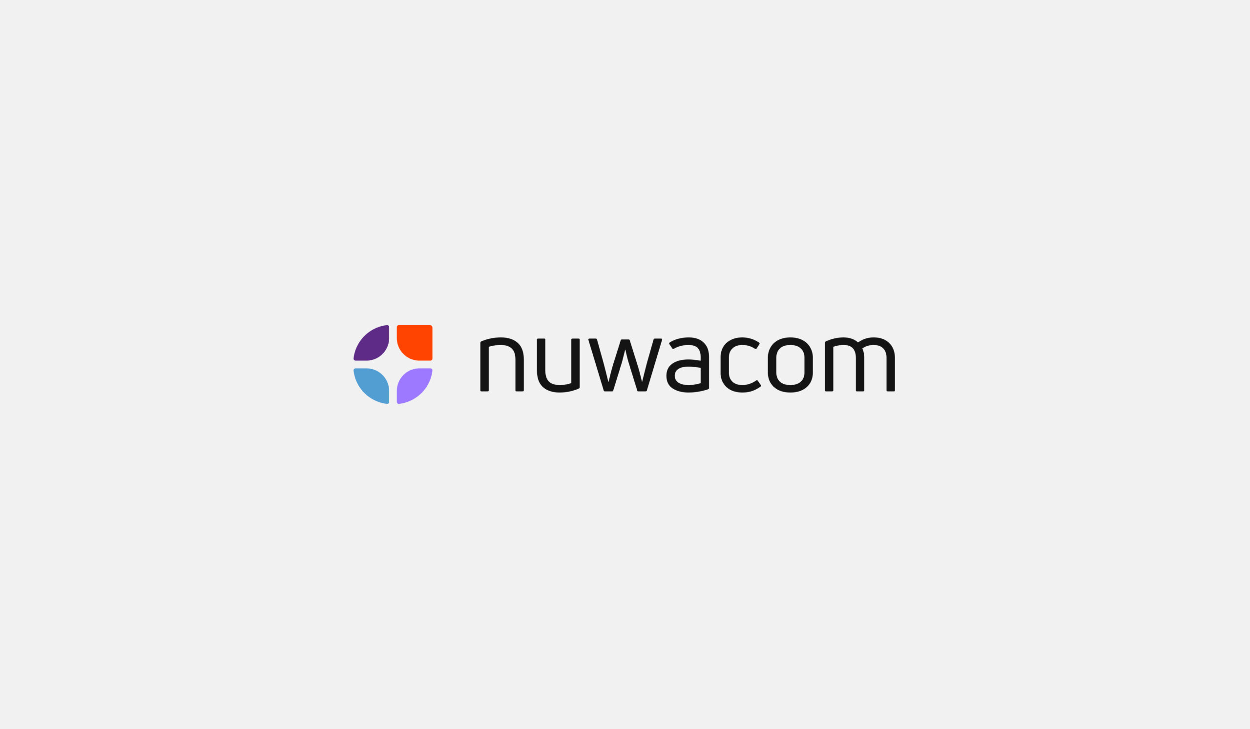
Our figurative mark combines multiple meanings.
- Workflows & Automation → The structure symbolizes efficiency and seamless processes, just like how nuwacom optimizes workflows.
- Collaboration → The design emphasizes teamwork and interaction, reinforcing our belief in human + AI collaboration.
- Efficiency & Growth → The upward-right arrow signals progress, acceleration, and success, mirroring how our platform helps businesses scale.
- Customer Control → The shape also resembles a steering wheel, symbolizing that our users always remain in control.
Typography: Dynamic and Tech-Oriented
A Bold Color Palette That Stands Out
While our signature light purple remains as a familiar foundation, we’ve introduced bold complementary colors that set us apart and reinforce our identity.
Unlike the often cold and distant palettes in our industry, our colors are designed to feel more human and approachable—because we believe technology should empower, not intimidate.

What’s Next – The Future of Our Platform
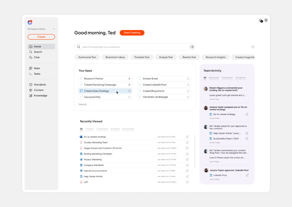
We are gradually integrating our new design language into the UI while focusing on making the user experience even more intuitive, efficient, and seamless. As we refine the platform, our priority remains clear: creating a workspace that empowers teams, simplifies processes, and enhances productivity.
Stay tuned as we roll out these updates and continue shaping nuwacom into the most intelligent and user-friendly workspace for marketing and communication teams.

Conclusion – A Brand That Evolves With You
We are continuously improving, evolving our platform step by step to ensure more intuitive workflows, better collaboration, and smarter automation. With each update, we are working toward a workspace that empowers marketing and communication teams to focus on what truly matters—creativity, strategy, and impact.
Join us as we shape the future of work. Be part of the journey. Your feedback, insights, and experiences will play a key role in refining nuwacom every step of the way.